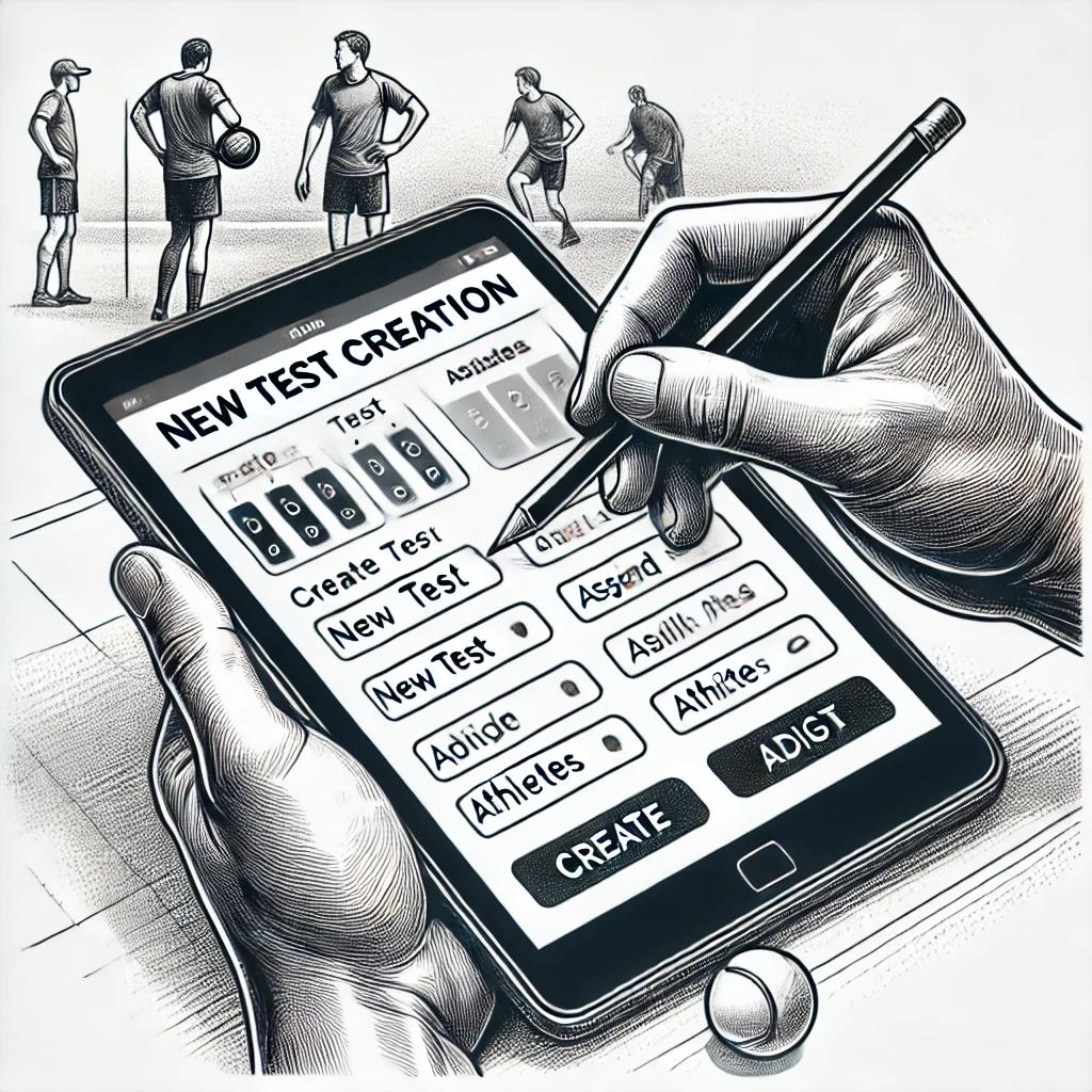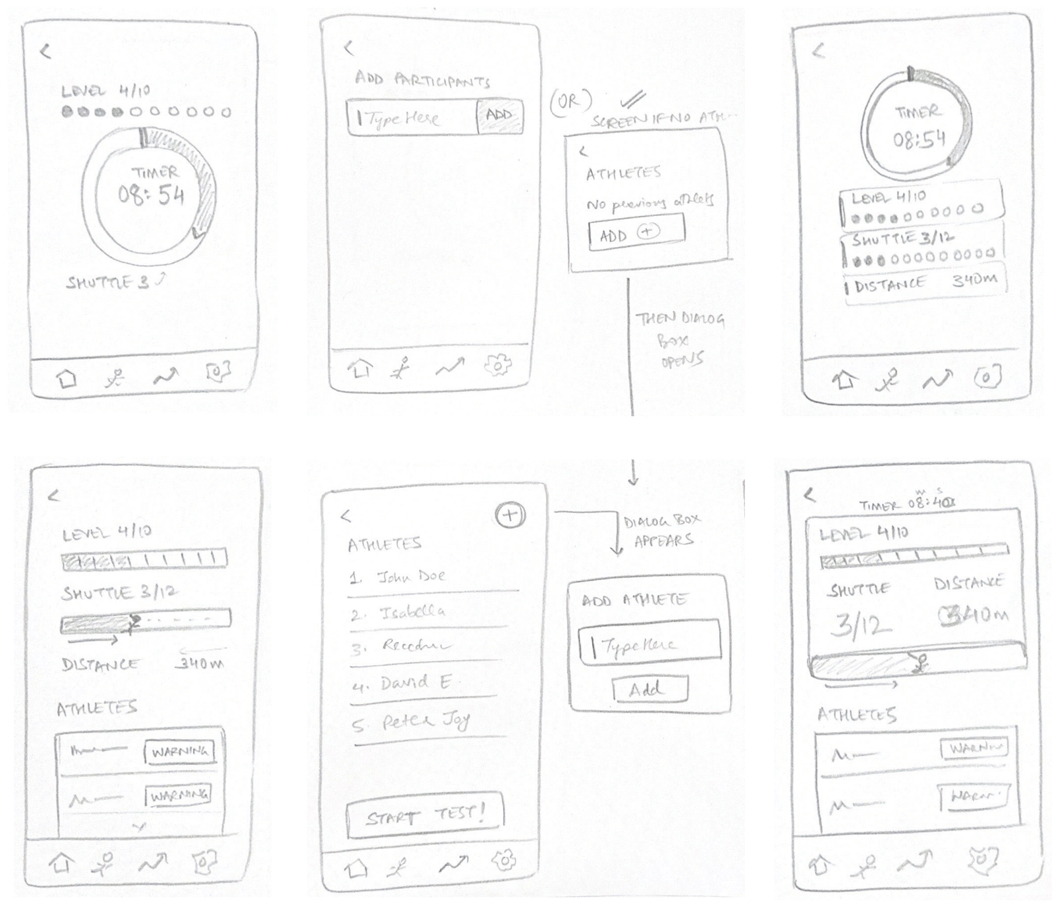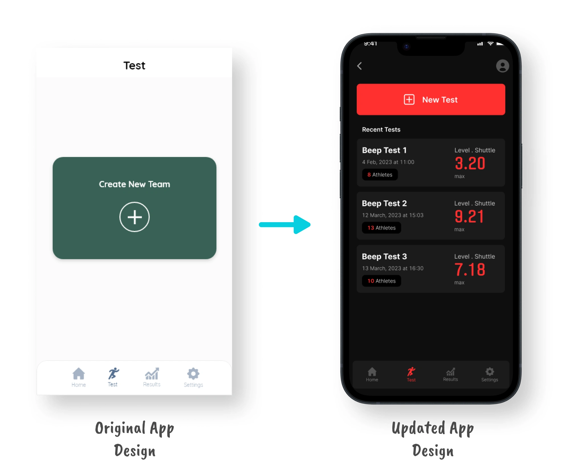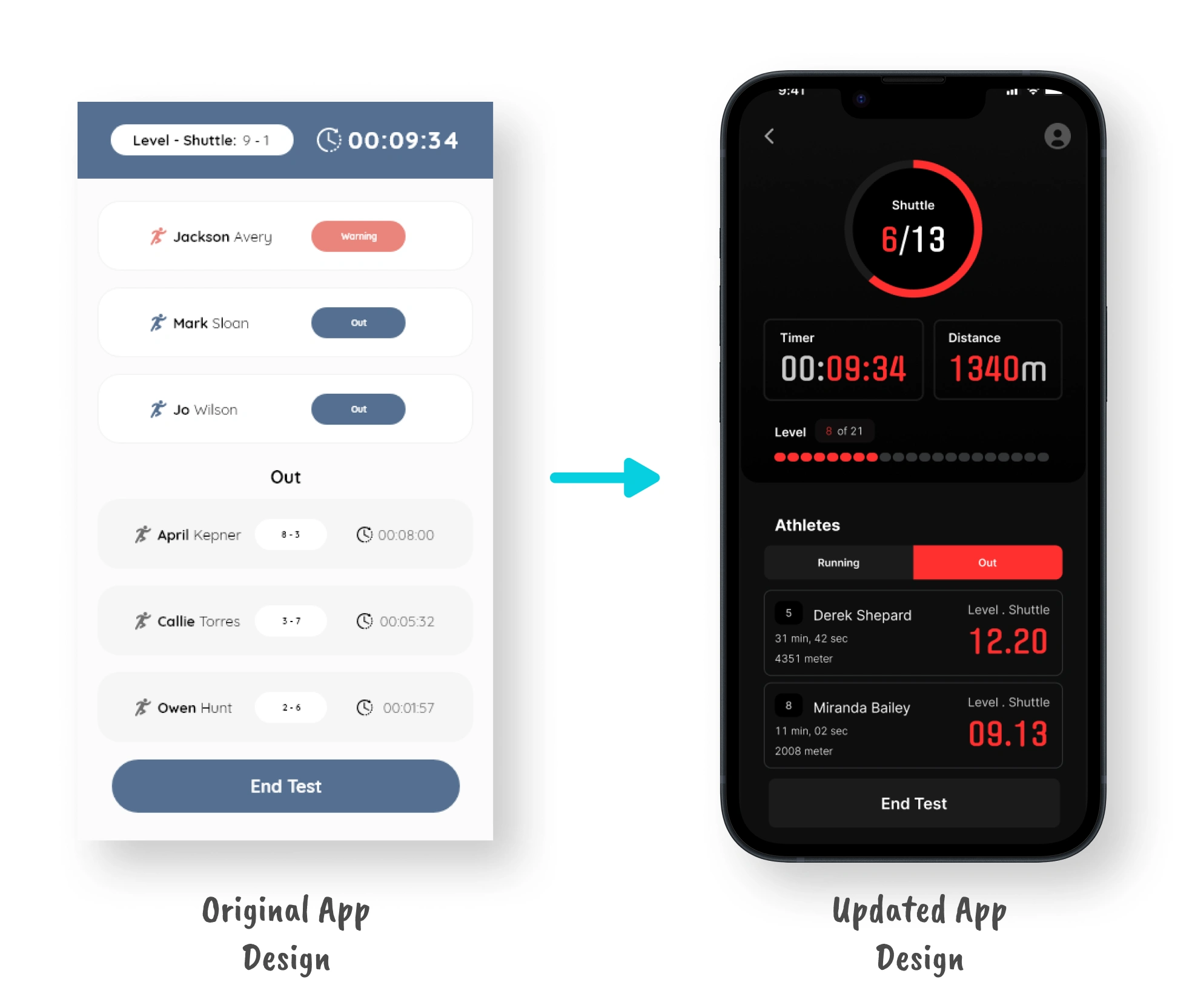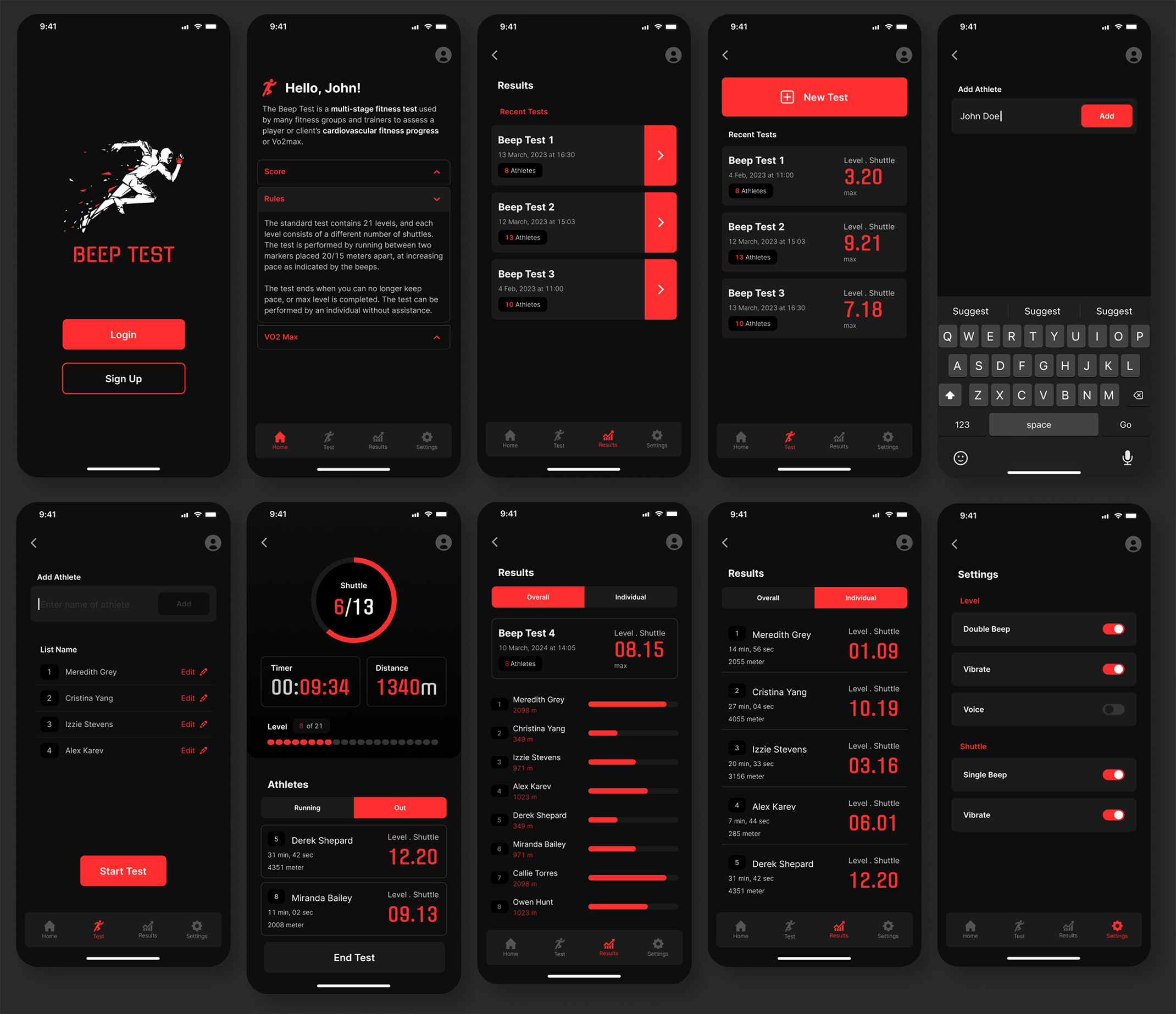


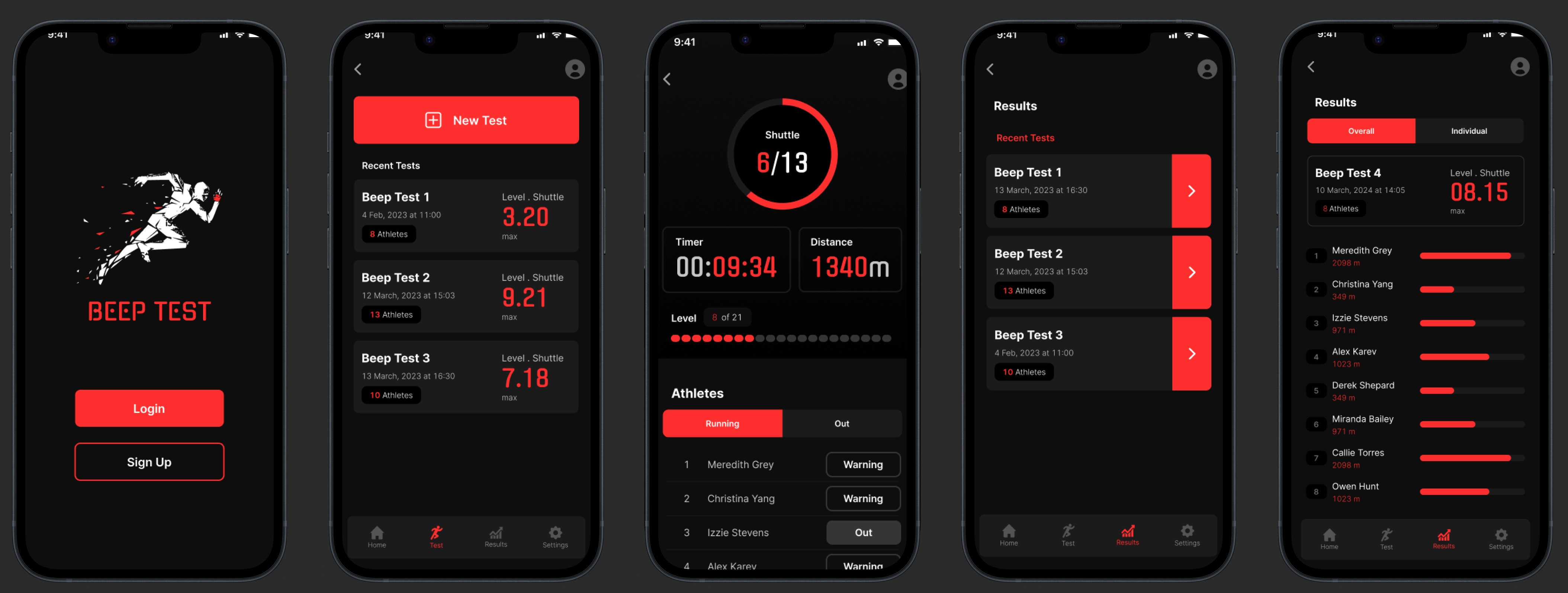
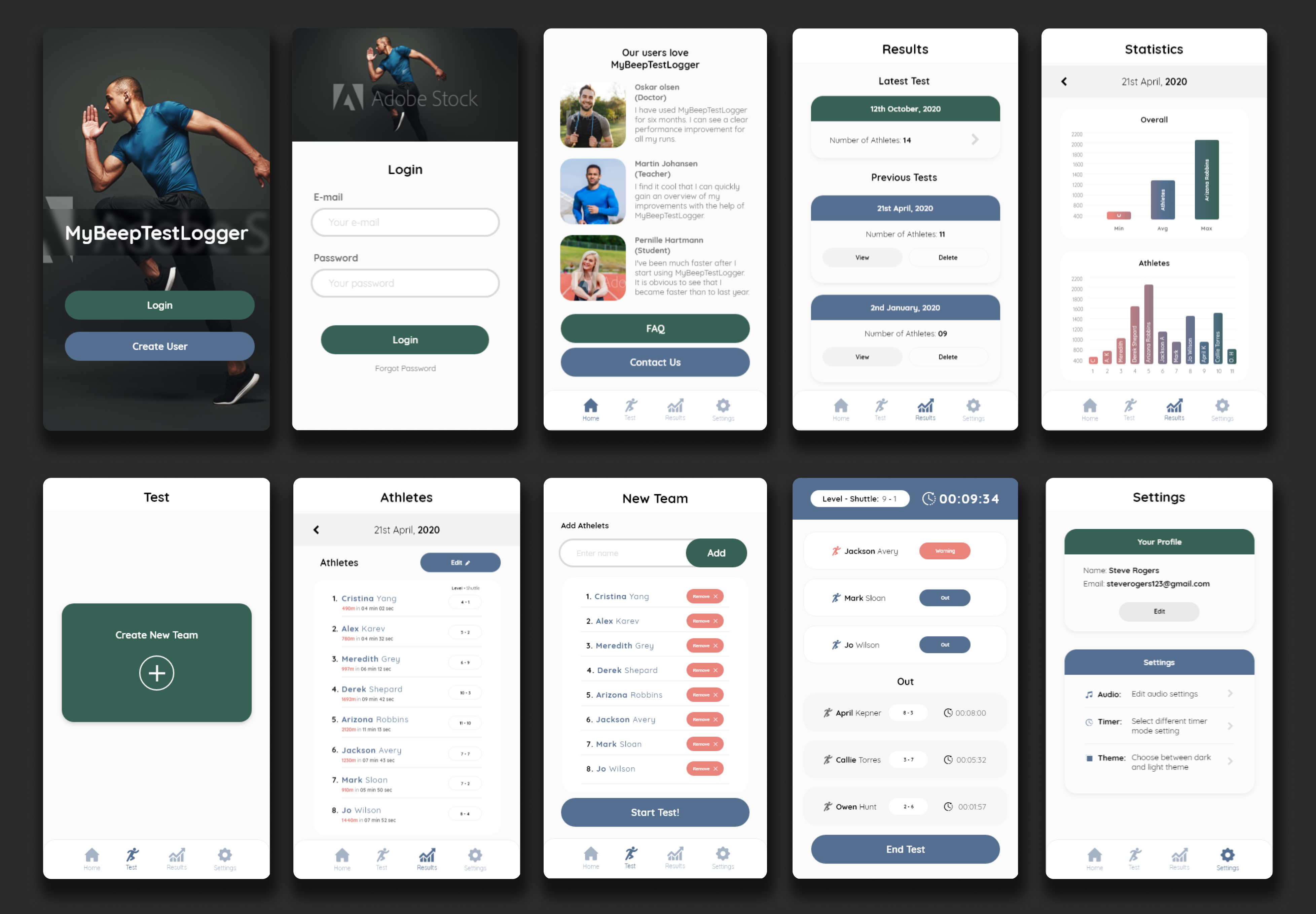
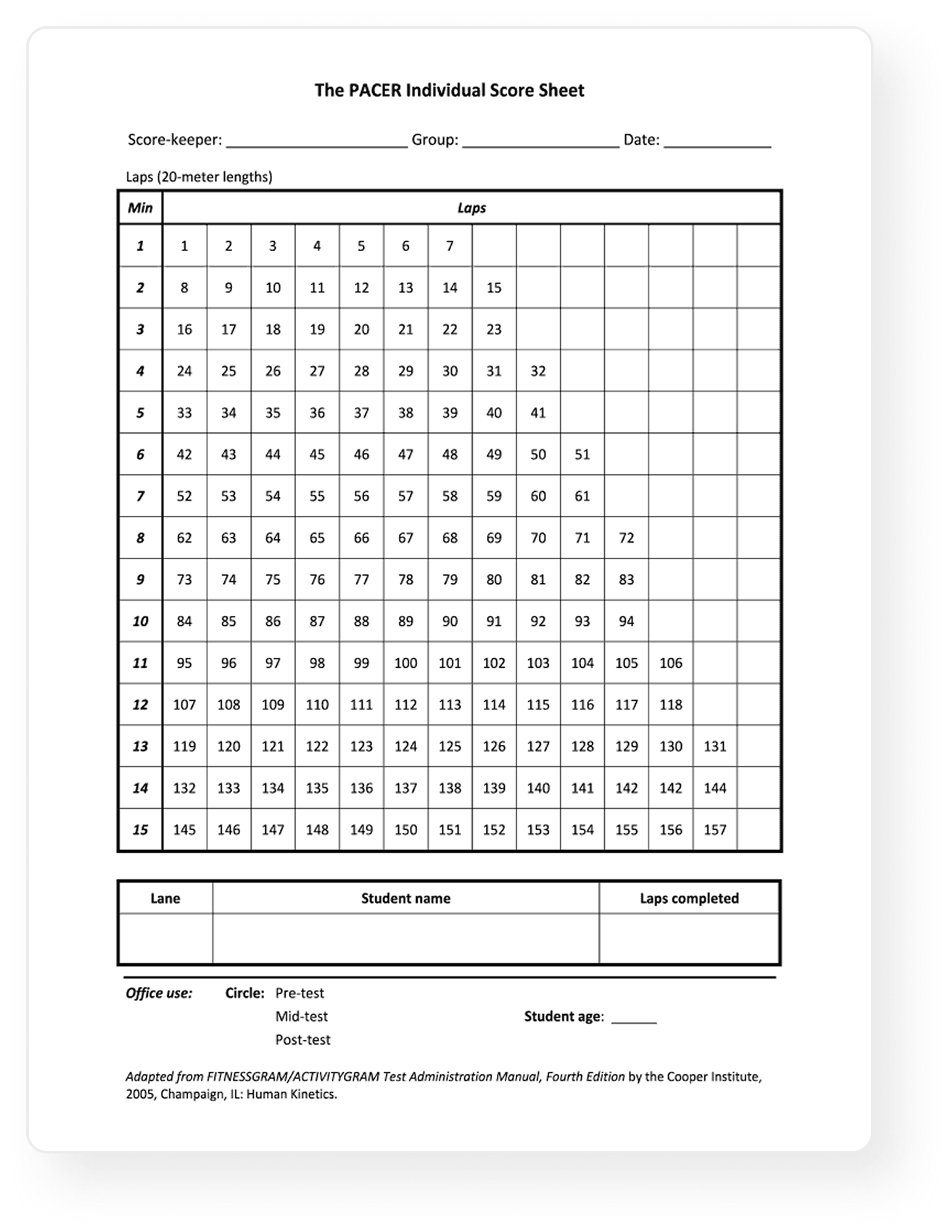

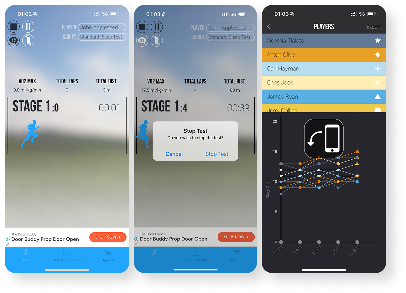

As a coach, I want to be able to create and assign athletes to a new beep test. I’d also like to edit or delete athletes from a specific test
~ Coach Alex
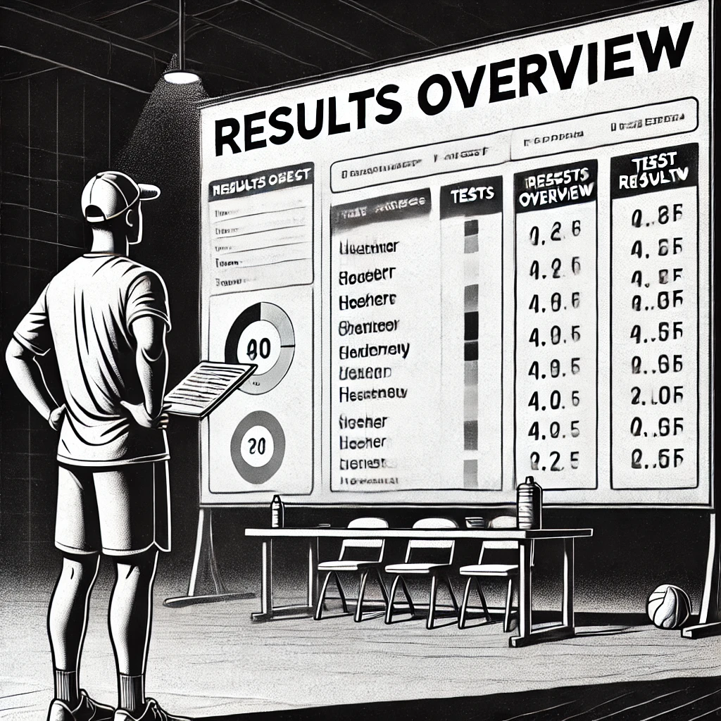
I want to be able to view all the tests sorted on a single page. Preferably with the newest one first
~ Coach Alex
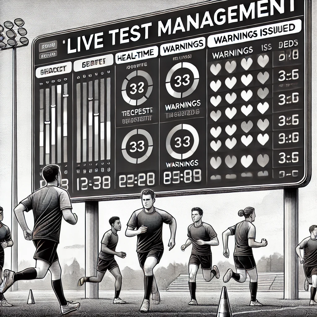
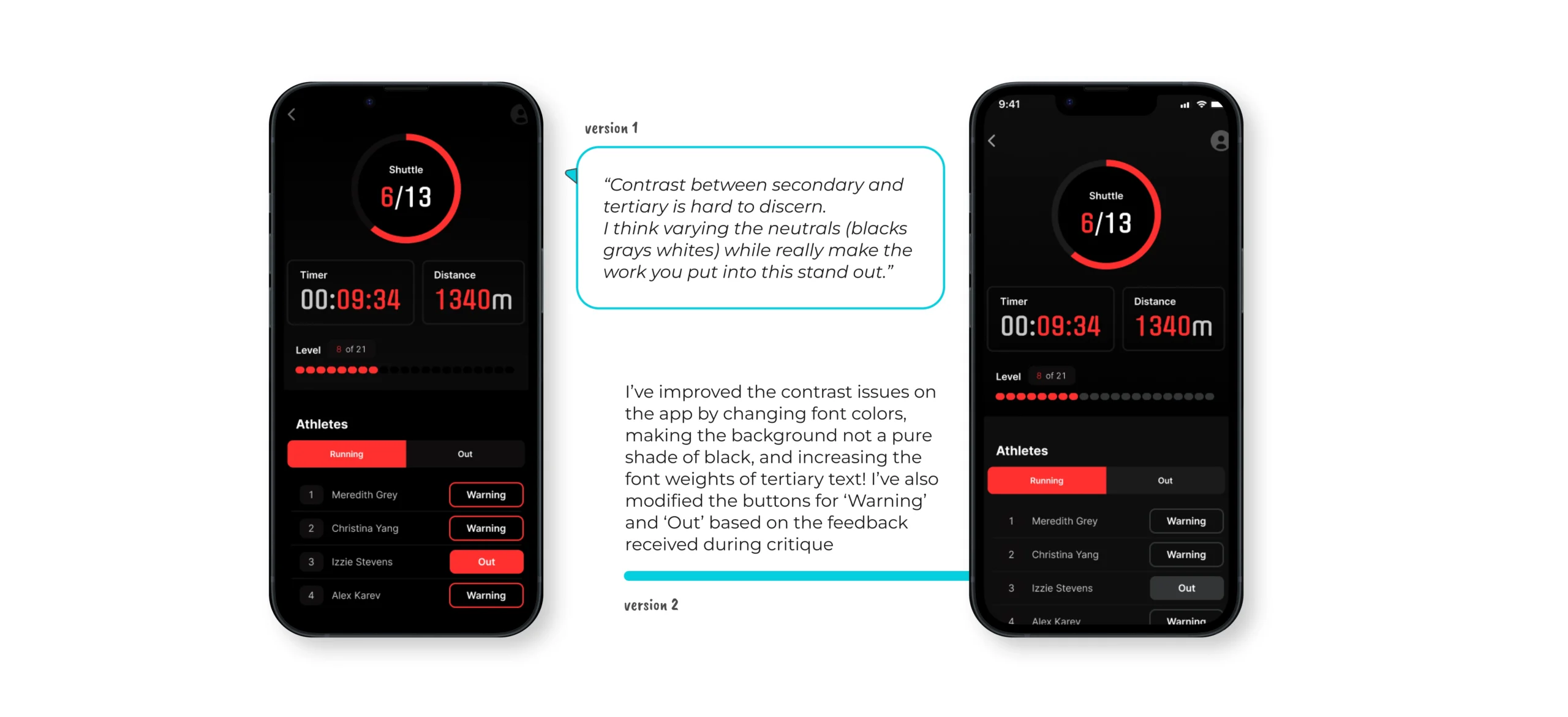
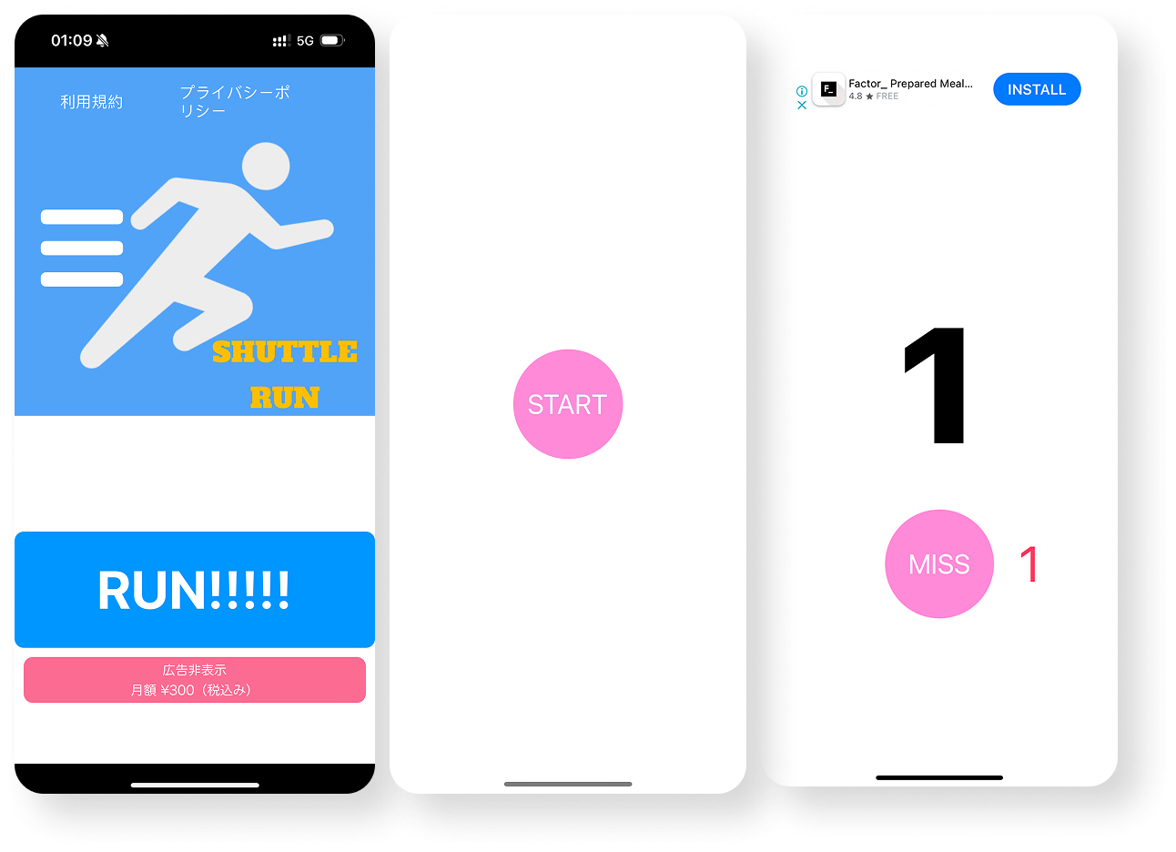
I want to see the exact status of the beep test and prompt athletes with warnings during the test
~ Coach Alex